There are many, many moving parts when planning a construction project. Existing tools in the market are either overly complex or don't address the industry's specific needs. This project's mission is to simplify this process by providing an all-in-one platform for planning, listing crew requirements, tracking materials and equipment, and managing costs. The design needs to prioritize ease of use, scalability, and accessibility across devices.
Lead designer
6 week timeline
There were a lot of input fields needed and when you have long forms, things can get very complicated and hard to use. Finding a balance of including all of the setup while keeping things easy to follow was tough.
There aren't many other platforms out there that are for construction planning, but there were a few to research. It seemed like the main issue was similar to what users face with any type of highly complex platform. Some of the findings were reported by the client.
This project went through more iterations than any project I've previously worked on. There are a ton of features and the information shown has to be well visualized. The first round was a good start, but needed more polish.
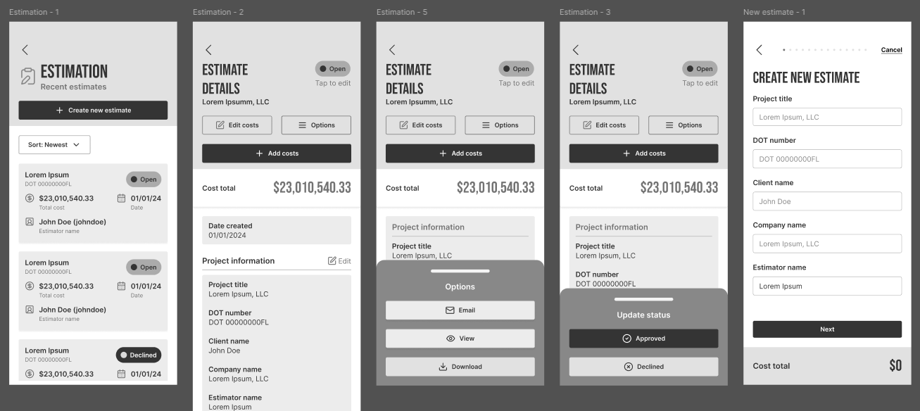
Since the mobile app was first, it started off rougher than the web app did. Not to mention figuring out how to place all the tables and functionality in while keeping it non-cluttered. There's a lot I cannot show yet, but you can glean some of the challenges.
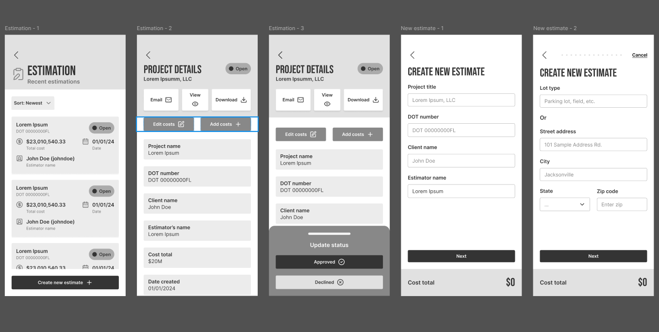
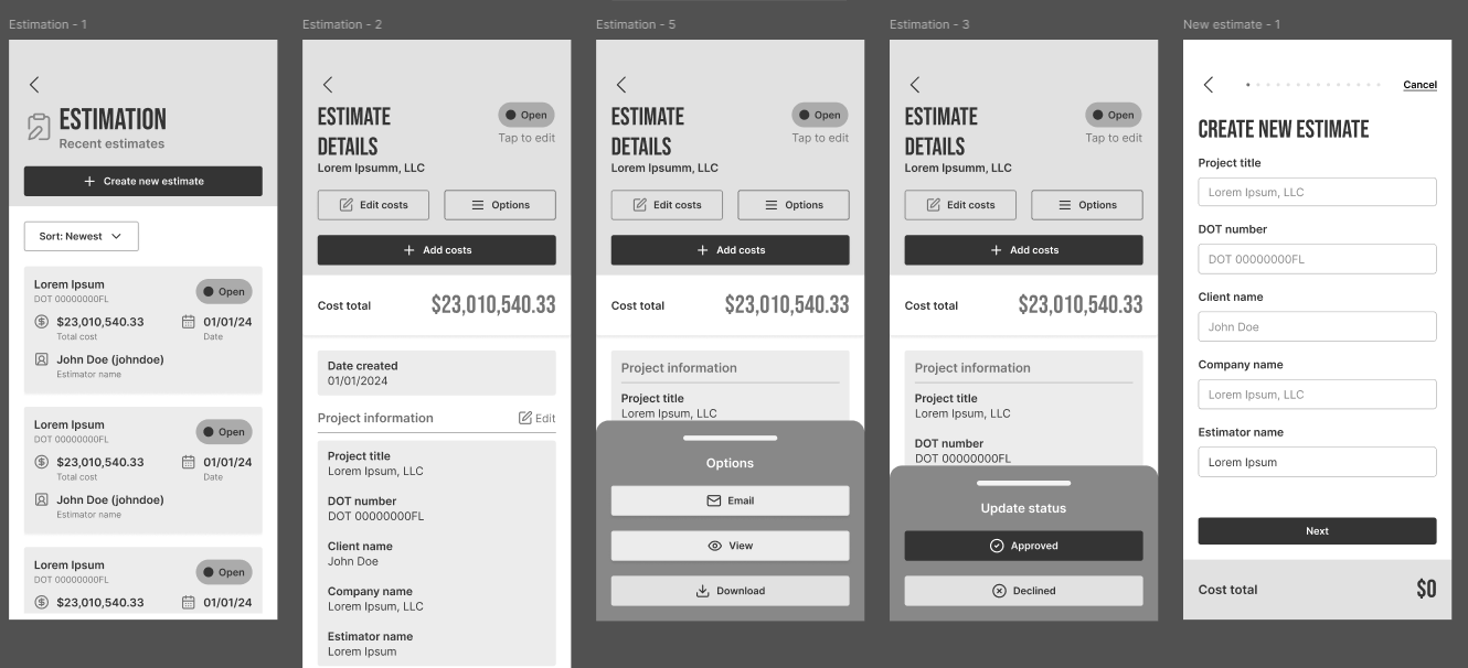
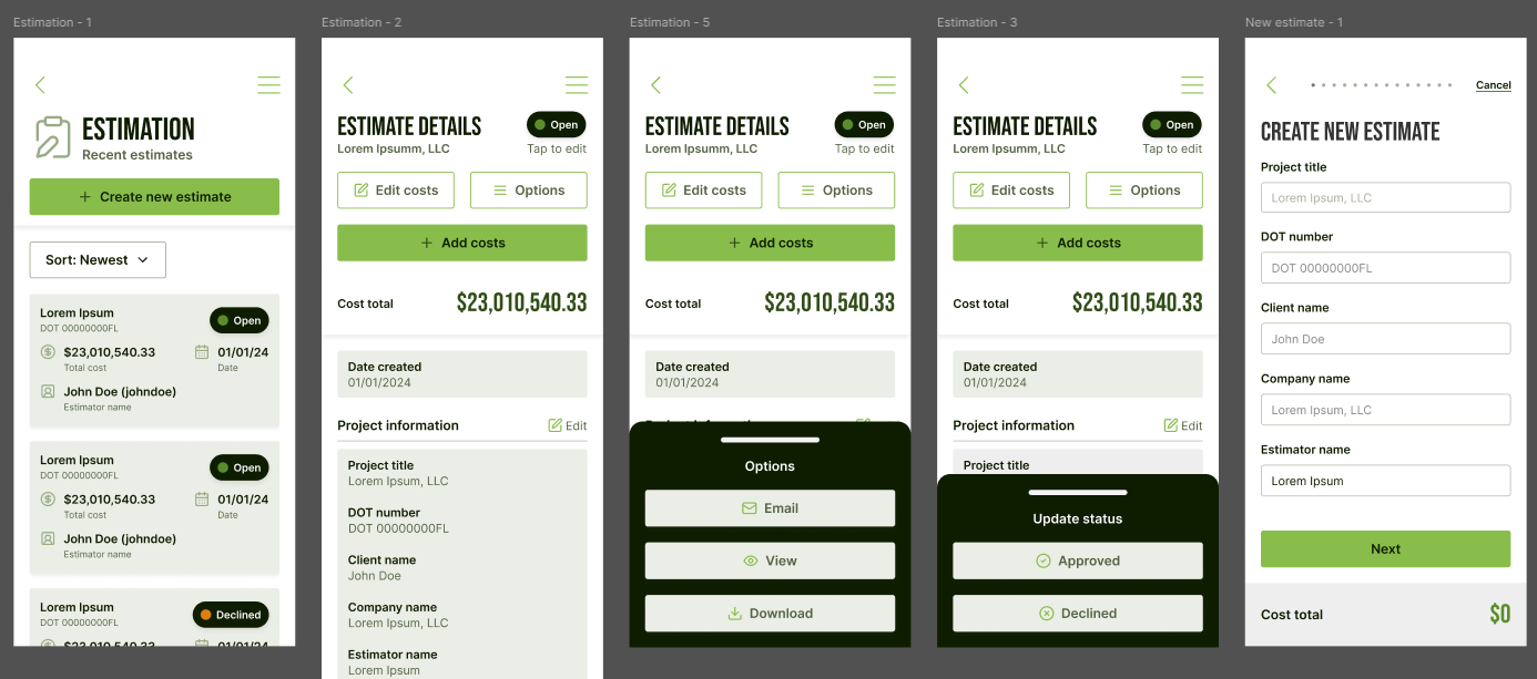
This second version has some small but very impactful changes to the mobile app. to the overall balance was improved, and the location of the buttons were optimized.
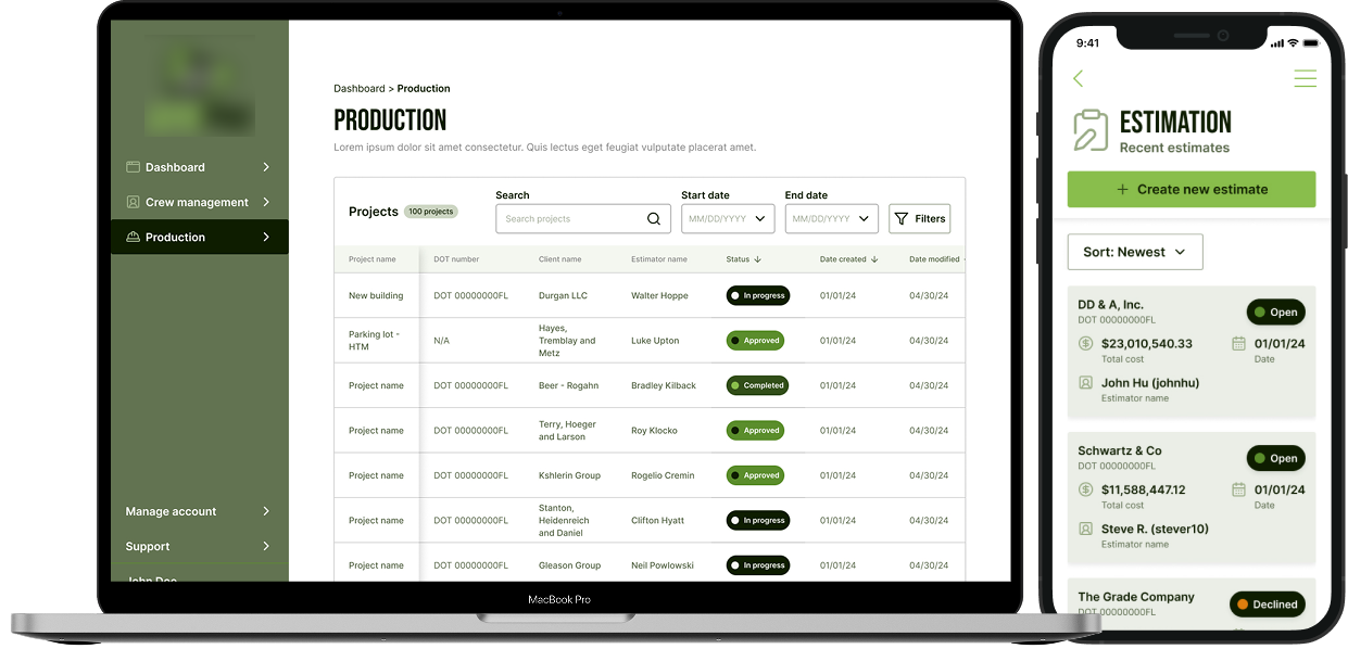
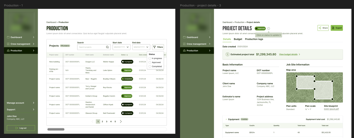
The web app got some quality of life changes, with the budgets being in clearer view while giving another option to go directly to the budget detail tab.
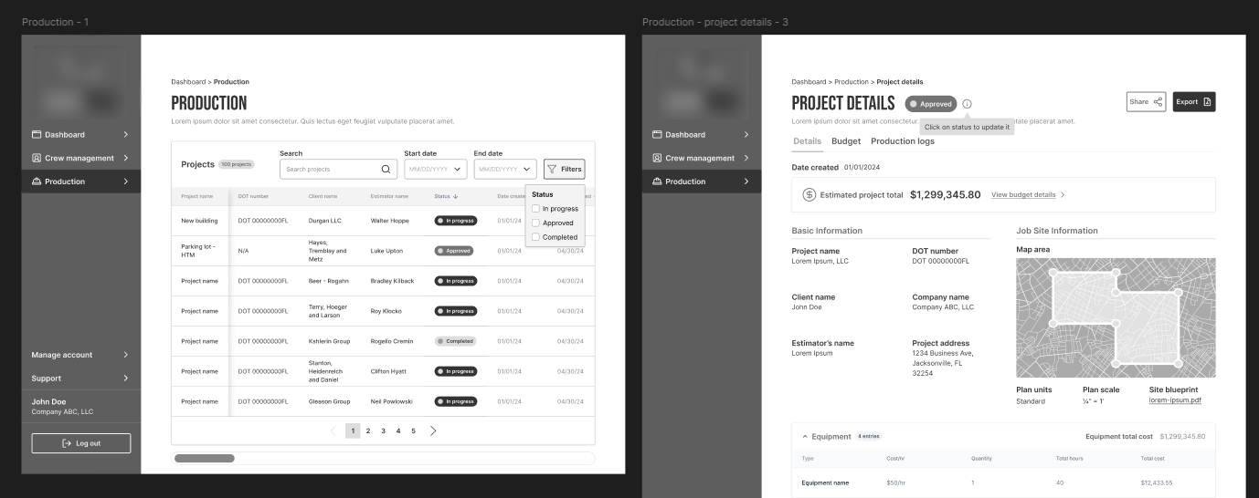
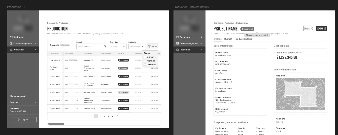
Very small change here. Just added more state options to the project status.
Luckily, there weren't really many changes needed when moved into design. I fiddled with color placement a bit then settled on the current color palette.
This is definitely the largest project I've handled to date. I am happy with the outcome so far. Though it is still in development, I am confident it will do well. While we were able to do some testing beforehand, you never know what kind of hidden issues can pop up after launch. During testing, we managed to catch a few small things, but nothing major luckily. I am confident it will be able to scale if needed.
